pyecharts is a Python library that allows you to create interactive and beautiful charts using Echarts, a popular JavaScript data visualization library developed by Baidu. pyecharts supports many types of charts, including maps, which can be used to display geographic data in an intuitive way.
In this blog post, I will show you how to use pyecharts to draw maps using the code repository https://github.com/isaacgeng/DrawChinaMap, which contains some examples of drawing China's administrative divisions with different levels of detail. The code repository also provides some data files that contain the coordinates and names of China's provinces, cities, counties and towns.
Installation
To use pyecharts, you need to install it first. You can use pip or conda to install it from PyPI or Anaconda Cloud respectively. For example:
Here is a blog post that I generated based on your request. Please note that this is not a professional advice and you should always verify the code before running it. I hope you find it useful and interesting.
pip install pyecharts
or
conda install -c conda-forge pyecharts
You also need to install some additional packages that are required by pyecharts, such as numpy, pandas and jinja2. You can check the full list of dependencies on the pyecharts documentation.
Drawing maps
To draw maps with pyecharts, you need to import the Map class from pyecharts.charts module. You also need to import some options classes from pyecharts.options module, such as VisualMapOpts and TitleOpts, which allow you to customize the appearance and behavior of your map.
The basic steps of drawing a map are:
- Create an instance of Map class with some parameters, such as width, height and title.
- Add data to your map using the add method. The data should be a list of tuples containing the name and value of each region that you want to display on your map. You can also specify some options for your data series using keyword arguments.
- Set some global options for your map using the set_global_opts method. You can pass instances of options classes as arguments.
- Render your map using the render method. You can specify a file name for your output HTML file.
For example, here is a simple code snippet that draws a map of China's provinces with their population density (data source: Wikipedia):
from pyecharts.charts import Map
from pyecharts.options import VisualMapOpts, TitleOpts

# Create an instance of Map class
map = Map(width="800px", height="600px")

# Add data series
data = [
("北京", 1318),
("天津", 1126),
("河北", 382),
("山西", 228),
("内蒙古", 20),
("辽宁", 299),
("吉林", 140),
("黑龙江", 84),
("上海", 3810),
("江苏", 766),
("浙江", 533),
("安徽", 431),
("福建", 304),
("江西", 266),
("山东", 622),
("河南", 563),
("湖北", 307),
]
map.add("Population Density (per km²)", data)

# Set global options
map.set_global_opts(
visualmap_opts=VisualMapOpts(max_=4000), # Set maximum value for visual map
title_opts=TitleOpts(title="China Population Density Map") # Set title for map
)

# Render map
map.render("china_map.html")
The output HTML file would be like this graph (here I used a map without Shandong Province as illustration to show you that you could alter the json file to change the base map):
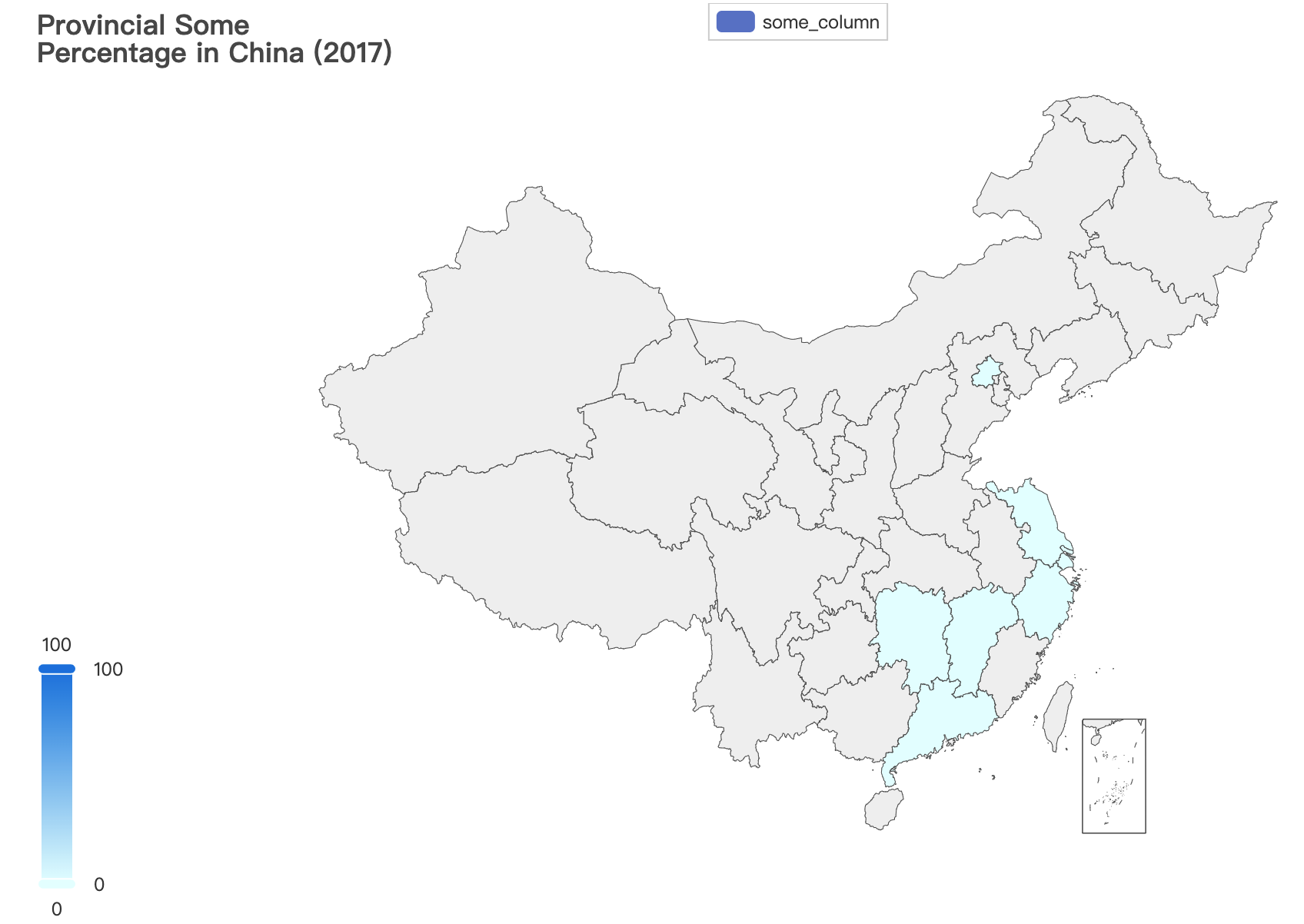
You can see that each province is colored according to its population density value. You can also hover over each province to see its name and value. There is also a visual map component on the right side that shows the range of values and allows you to filter them by dragging the handles.
Using DrawChinaMap repository
The DrawChinaMap repository provides some useful functions and data files that make it easier to draw maps